Tuesday, 24 November 2009

WOODEN BAGS

Caroline Jarvis from Central Saint Martins graduating year 2009 has designed these wooden bags. They look like bird houses.


Come out little birdy

This one is also a rectangular wooden bag / backpack with a frypan stuck to it, but somehow it looks more like a kitchen cupboard gone walkies than a stylish avant garde bag. I am starting to think that catwalks are a place to make ridiculous things look fashionable.


I still love the use of strange materials in bags.

Friday, 20 November 2009

AVANT GARDE BAGS

Here are a couple of random photos of some interesting bags... worn in some pretty interesting ways around the neck. This one below is made from two sections joined together by chain and slung around the neck.


This one here, i'm not sure whether it is actually a bag or just a neck piece. There is a definite relationship between the two. The new way to carry stuff is definitely draped around the neck, i find these pieces really inspirational and new.

Tuesday, 17 November 2009

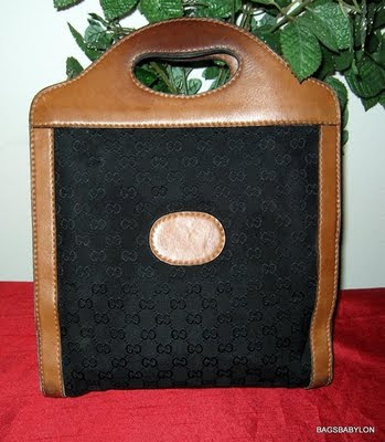
VINTAGE GUCCI SHOPPER

This vintage Gucci shopper caught my eye. The understated tonal body fabric against the worn leather is lovely, like sitting on a big comfy couch in front of a fire on a rainy dark windy day.


Sunday, 15 November 2009

MARNI SPRING SUMMER 2010 BAGS

Some of my favourite bags from Spring / summer 2010's catwalks. Recently in Milan, Marni presented some really nice understated bags. This one here below has a laser cut perforated design with a bit of an arabic flavour. To chill this out, the rest of the bag has a really simple almost sack like construction with a really basic handle.


Its not to say its not glamorous, in fact, understatement is the key word of the season. There was not much crazy stuff going down on the catwalks this season overall in the accessories world. Brands were bringing back their iconic styles in new materials and slightly updated executions.


I really like the bag in bag look. It communicates a feeling of old meets new, tradition meets modern and more casual methods. The outer layer is a bit like the bag is wearing a pair of trousers or a skirt. I know that is a ridiculous way to describe a bag, but do you see what i mean. Maybe its more like a sleeping bag.


Here we go again with a larger version which, i don't think works as well in the smaller clutch size but is the same idea and executed very elegantly.


I'm not quite sure about the edge piping and i don't really dig the big brushed gold balls as the clasp opening, i can see something a bit more raw and original like some uncut stones or maybe something leather covered.


Strangely the big balls work on the smaller clutch a bit better, but i'd love to see this bag with the frame and balls covered in beautiful soft lambs leather Natalia Brilli-style. (please check out her website, you won't regret it) http://www.nataliabrilli.fr

Over and out.

YVES SAINT LAURENT SATIN CLUTCH

This YSL clutch is pretty. It reminds me of a more elegant version of my wrap bag shown in red in my previous post. I love the idea of wrapping, it makes me think of presents, when i think of presents, i think of being a kid. Them were the good old days.

Saturday, 14 November 2009

PUMA BAGS BY JACQUI MA

Just cleaning up my computer and came across these images of some bags that i designed with Puma. The ones below had lots of pockets all with different fabric linings so you can remember what you put in each. Mesh, waterproof, white, black and nylon - all with a different purpose. The range had a shopper, backpack and messenger.


The one below never got made but i love this sample. It has velcro on the front and little purses attached with chains which you can stick on wherever you want on the front panel of the bag. I love products that have an in-built sense of playfulness.


This one is inspired by my obsession with tape. The webbing tape wraps around the bag like a loose bandage. I love the contrast of the soft cotton webbing with the plastic coated main body material. I also like how the tape obscures the logo underneath.

Thursday, 12 November 2009

TROPICAL ISLAND WOODEN BAG

I am collecting pictures of wooden bags. But everytime i find one i happen to be in a different place with a different type of technology (phone, computer, camera) than the last. So i thought i would just post this one all alone.


The key things i like about this bag are:

  • Jewelles and faux diamonds stuck on with glue in the shape of palm tree trunks and the sun and a sailing boat.
  • The word 'tropical island' painted in the same blue as the water in the bottom left corner of the bag.
  • The lovely vintage plastic handle with elegant handle bases and sophisticated connection to the box part of the bag.
In fact, there are not many things that i don't like about this bag. I wish i could see the inside. I think it would be lined with padded pastel yellow satin look polyester symbolising the sand collected at the island.

Recently when i was on a (sort of) holiday in phuket we had the option of a day activity called "bag making", i wonder if this is what i missed out on? Hope not.


Flash forward a few days... i found this wooden case as well to match the one above. Once again, the handle rocks.

IPHONE CASE

Leather wrapped around soft felt, i like the simplicity of this iphone case. I am sorry i don't remember where i found it.


The asymmetry and raw edged leather is really understated.


What a nice little home to keep your iphone in.

Sunday, 8 November 2009

WRAP BAGS JACQUI MA

These photos were part of a details experiment / study that i did when i was working at puma a couple of years ago. i have always loved the bold effect of strapping (you can check out more about my tape obsession on my other blog http://ilovestickytape.blogspot.com/). We ended up sampling a few different versions of this bag, then it didn't really go anywhere after that, i think it was maybe a bit too avant garde (uncommerical) at the time for the brief but i still really like them and had a lot of fun making them.


The bag itself was picked up as a vintage sample from somewhere in london and the red cotton webbing is from Kleins habadashery in soho. (great place to buy bits and pieces). the part i love the most about designing bags is the experimentation. Typically in the next stage you have to make the bag actually work and then think of all the other practical aspects like interior, pockets, target audience, price point and the rest of the boring stuff that determines whether your bag is actually going to get made or not.

Saturday, 7 November 2009

CUPCAKE PURSE BY JUDITH LEIBER

These cupcake bags by Judith Lieber found on net-a-porter are slightly addictive to look at and very novel but overall quite irritating.


I saw these bags in a department store in Bangkok and they were super expensive. I can't remember how much but i remember gasping.


This is the kind of present you would buy for the 'woman who has everything', i would rather just get the money.


What the hell would you put in it. oh, i know, a cupcake.


i bet one day i will own one of these.

Wednesday, 4 November 2009

CAT T SHIRT

This has nothing to do with bags, but has something to do with my previous post regarding realistic looking cats printed onto mundane items. I couldn't go past posting this, it is from an awesome blog called http://www.backyardbill.blogspot.com/

So check out the previous post too, otherwise you will find this posting quite random.

Monday, 2 November 2009

CAT BAGS

Its no secret, i love cats, and more than that, i love realistic painted cats painted on canvas shoppers.


Sunday, 1 November 2009

COMME DES GARCONS WALLETS

My new favourite colour of the moment is this green. I nearly bought a snowboarding jacket this colour yesterday. But fortunately, i restrained myself and ended up buying a slightly more chilled out colour. But things brings me to why i posted these cute little Comme des Garcons wallets. The iconic wallet which needs no introduction.


I really really LOVE the polka dot ones that you can buy at Dover Street Market at the moment. Check them out. http://shop.doverstreetmarket.com


Call me crazy but i think that these three colourways look fab together. The design is so stripped back and chilled out that they even left off one of the corner patches.